cmpnyinfo: visualizing financial statements
Introduction
I am trying to make a website, where the users can search up a name of a company in the KOSPI(Korean Composite Stock Price Index), and get the basic financial information of the company over the past decade or so.
Here’s what I mean by ‘financial information.’
-
Different types of incomes (Net Income, Operating Income, etc)
-
Ratios (ROA, ROE, PER, D/E, etc)
-
Others (market cap, stock prices, etc)
It is basically providing people a easy-to-access, easy-to-read financial statements of their company in interest, along with some essential analytical datas, ALL REPRESENTED IN GRAPHS, so that you can effectively read the trend.
There are already websites like investing, but I want a more light-weight, casual and mobile friendly website, without all the pop up adds and advertisement videos playing in the corner.
Key Values/Goals
-
Light-weight
-
Casual
-
Simple
General Structure (for now)
Whenever I have to build something in a level any bigger than a single, file, I draw out the general structure. Like this.
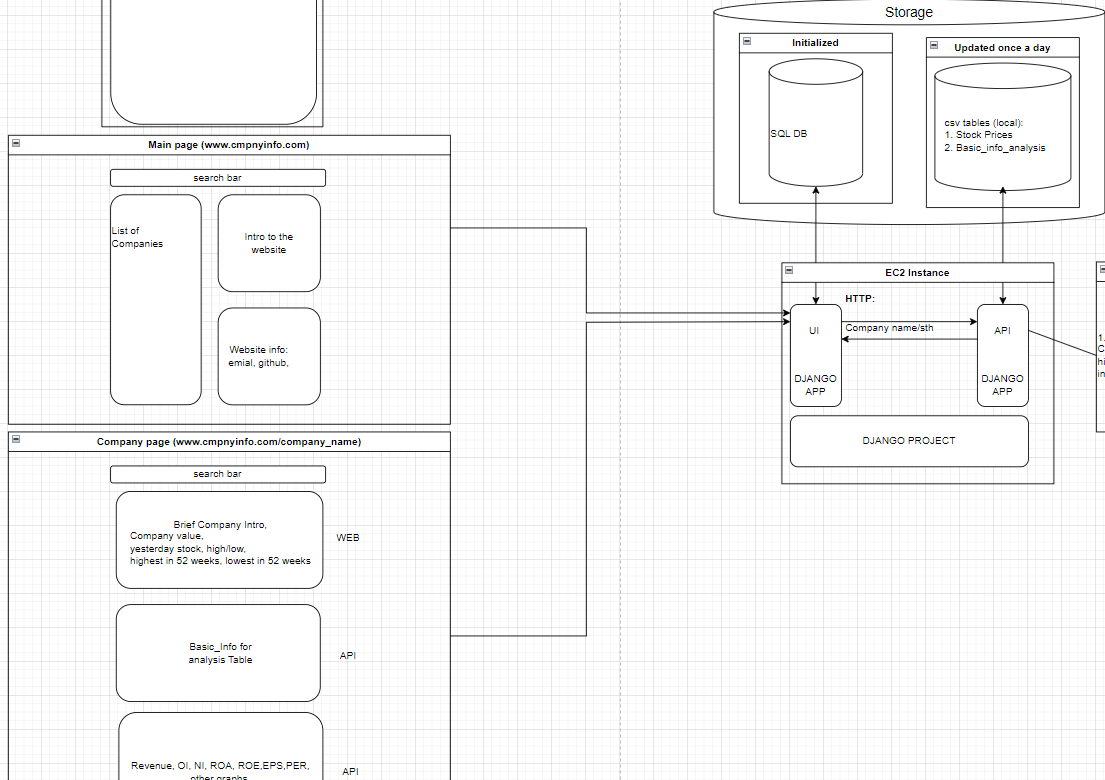
Sorry for the unreadable texts. Here’s the url to the diagram
Tech Stack:
-
Git, Github
-
Docker
-
Python libraries (pandas, plotly, many more)
-
DJANGO
-
AWS EC2
-
SQLite
Challenges
-
AWS
- This will be my first project to use AWS. I have previouse experience with PaaS (render), but not IaaS.
-
Graphs
-
Drawing graphs using the plotly library, and displaying onto the webpage
-
handling the graph between the API app and the Web app,
-
And all the other minor details. I can already see myself fixing a stupid bug for docker for hours 😭
-